BROCKMANS GIN
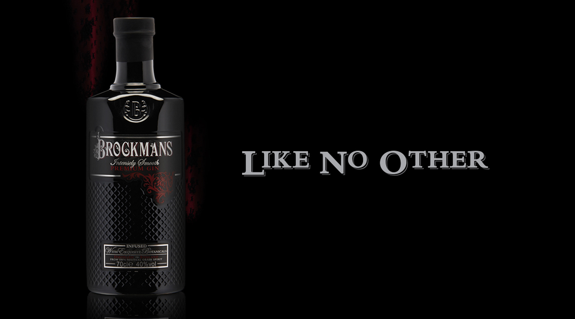
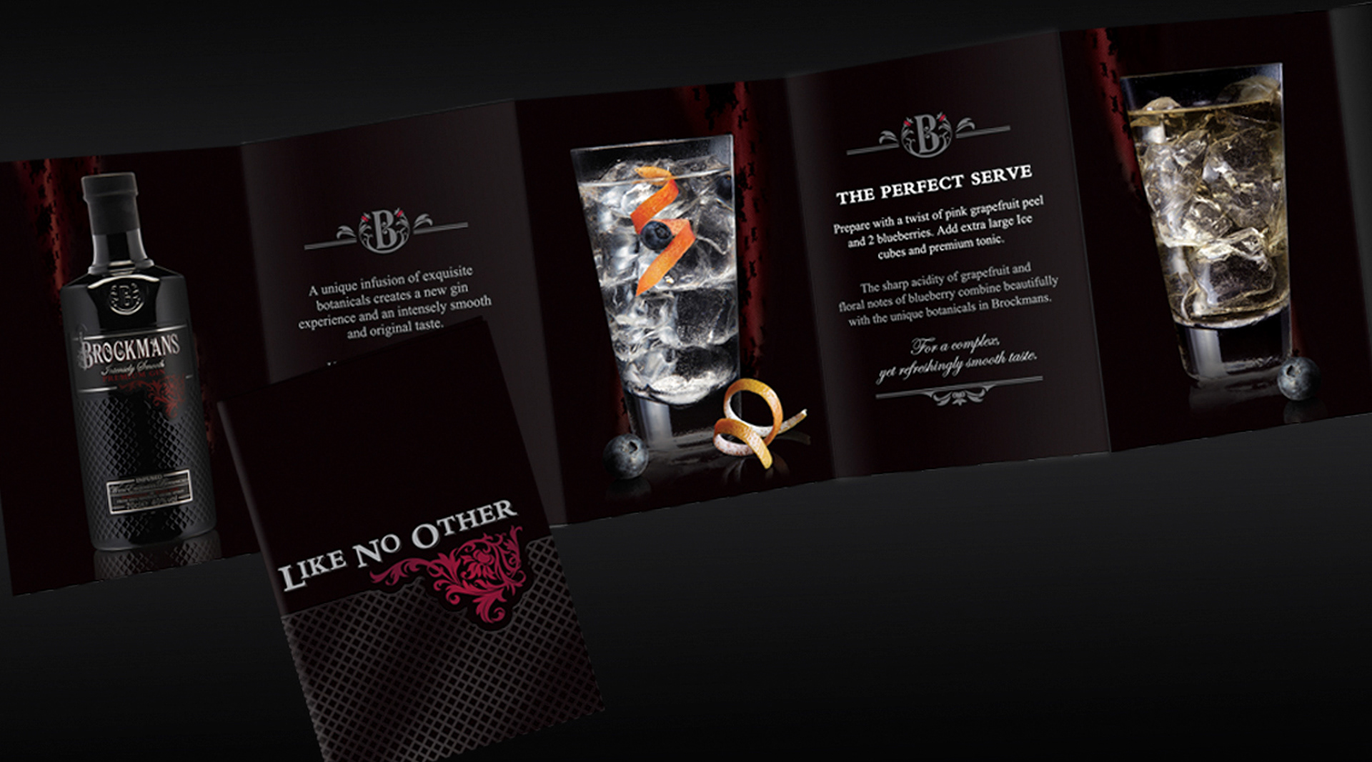
One of the most significant projects in my career has been my work with Brockmans Gin.
Working closely with the brand over a number of years, I became one of the custodians of its visual identity, helping shape how the brand appeared across multiple touchpoints.
Projects included:
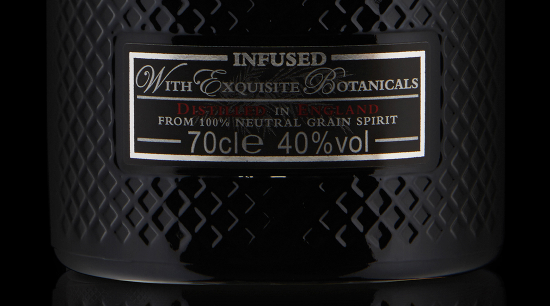
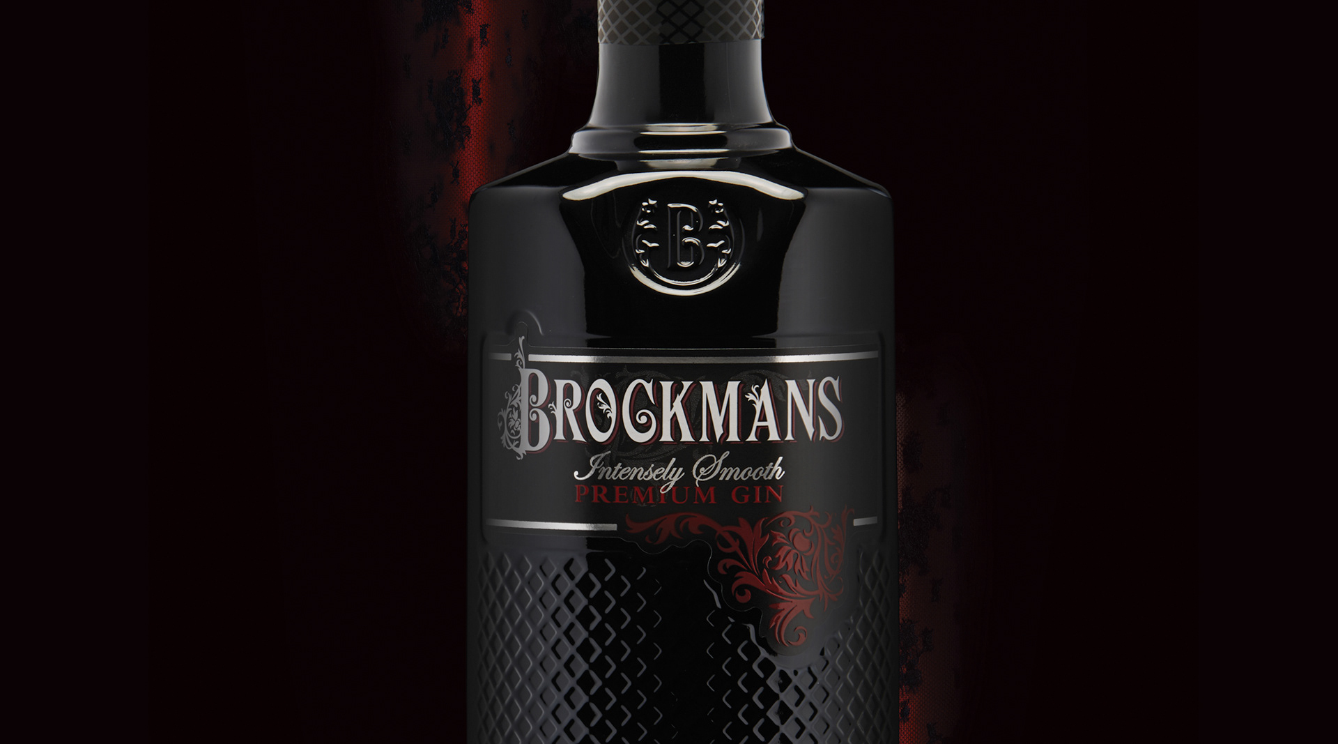
- Redesigning the iconic Brockmans bottle, introducing the signature cross-hatched glass texture and distinctive 'B' cartouche.
- Creating the original international brand guidelines to ensure consistency across global markets.
- Designing brochures, POS, event graphics and exhibition materials.
Supporting international marketing campaigns and branded communications.
- Creating the original international brand guidelines to ensure consistency across global markets.
- Designing brochures, POS, event graphics and exhibition materials.
Supporting international marketing campaigns and branded communications.
Following the bottle redesign, Brockmans experienced a reported 220% increase in sales, with the brand expanding into more than 20 countries worldwide.
CARIEL VANILLA VODKA
Cariel Vanilla Vodka already held a unique place in cocktail history, having been recognised as the vanilla vodka used in the creation of the very first Pornstar Martini.
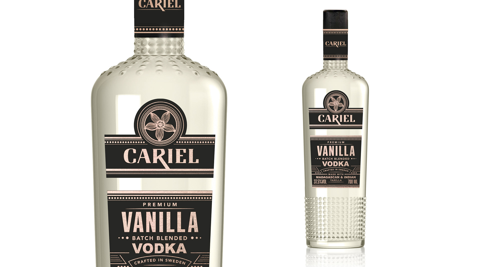
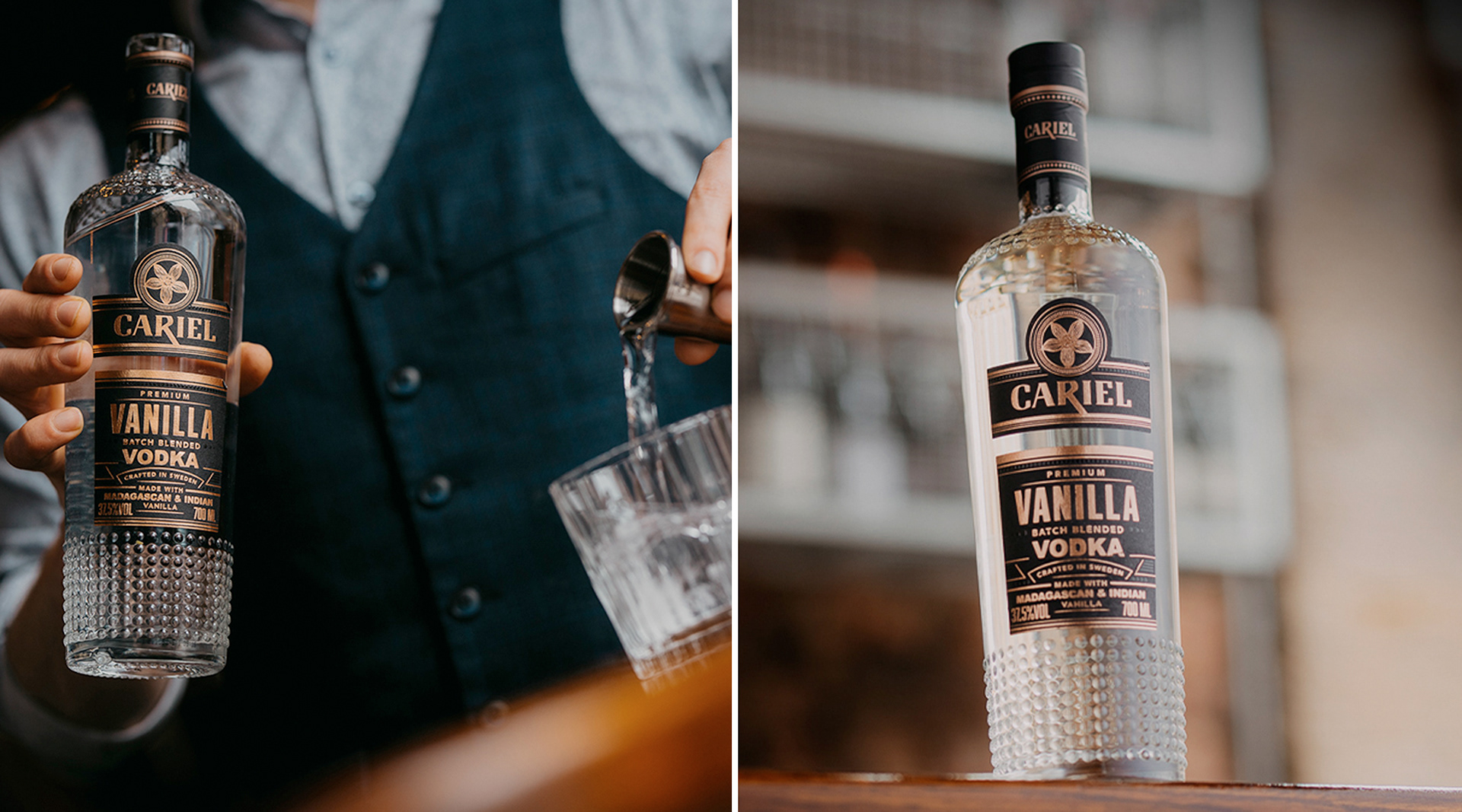
My role was to lead a complete visual refresh of the brand, modernising its identity while retaining the character that made it distinctive. The project included a redesign of the logo, a full range of bottle labels and a complete redesign of the glass bottle itself, creating a more refined and premium presentation that strengthened its presence on the shelf.
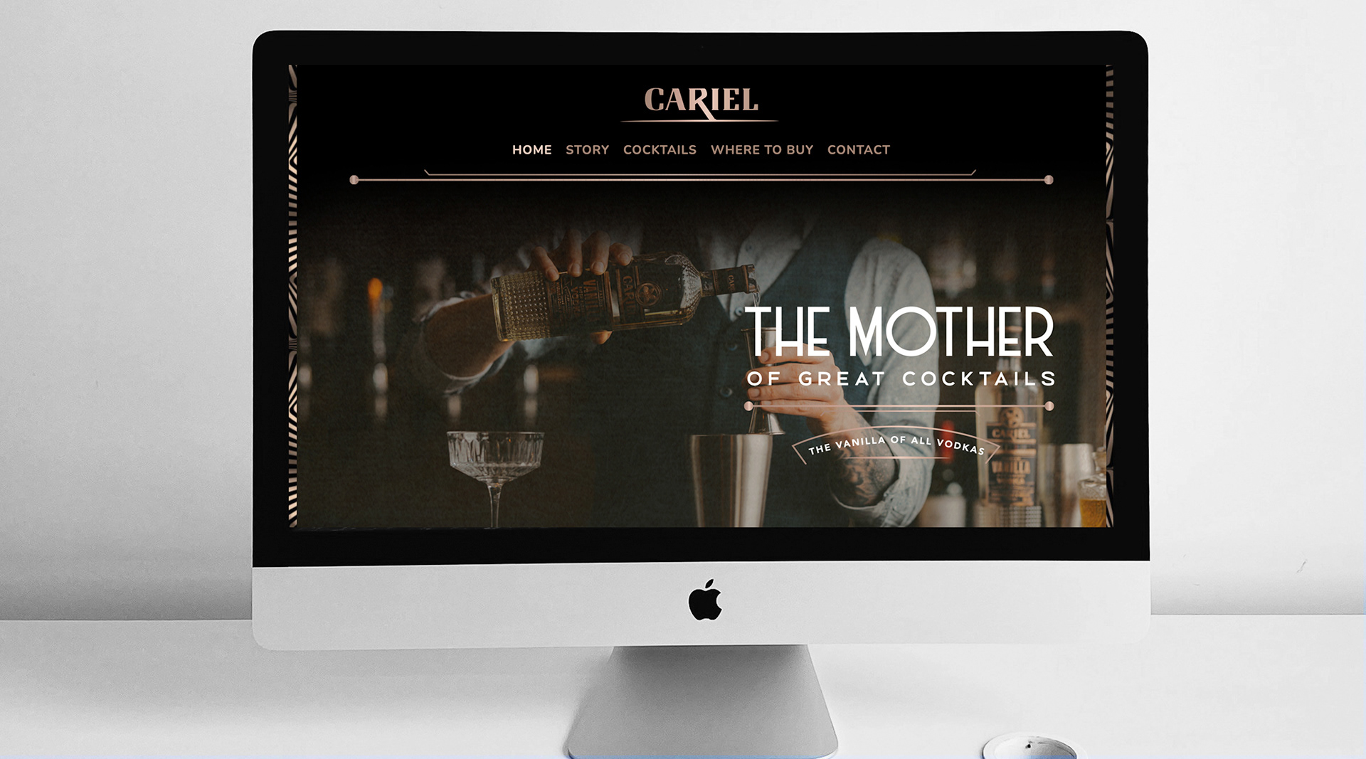
Alongside the packaging, I also designed the complete website user interface, producing the page layouts and visual templates that were subsequently developed into the finished website by an external web development team.
The result was a cohesive brand identity that elevated Cariel across both print and digital touchpoints, ensuring every customer interaction reflected the same premium look and feel.
ARUNDEL BREWERY
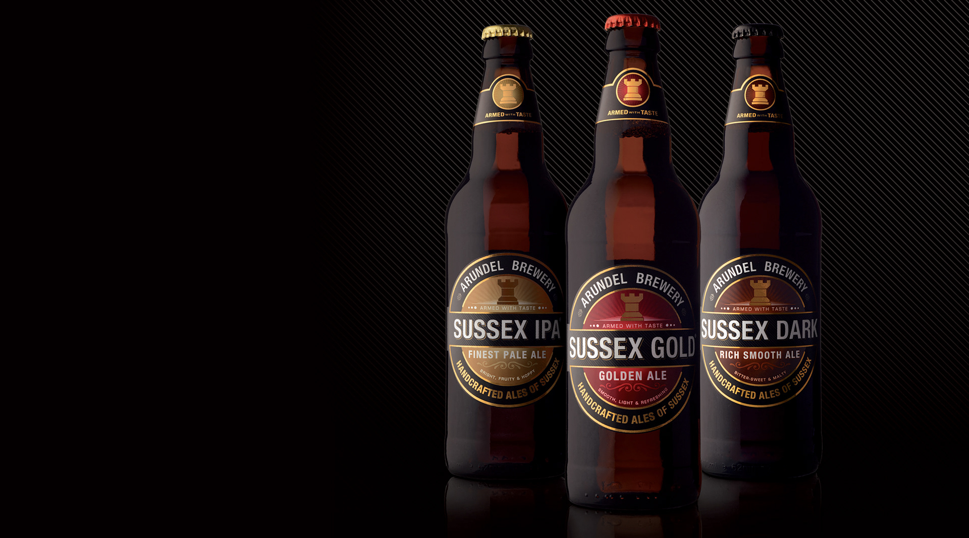
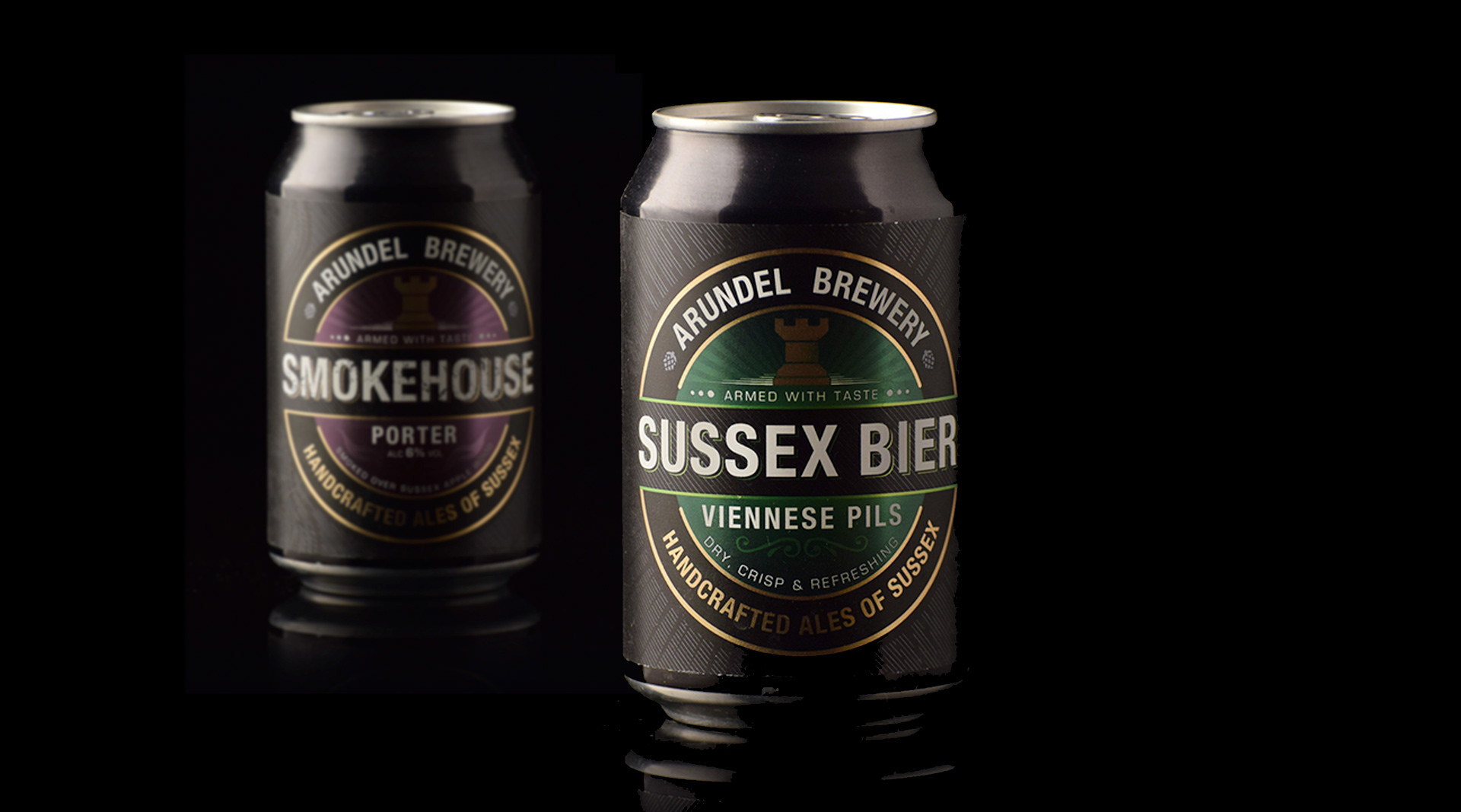
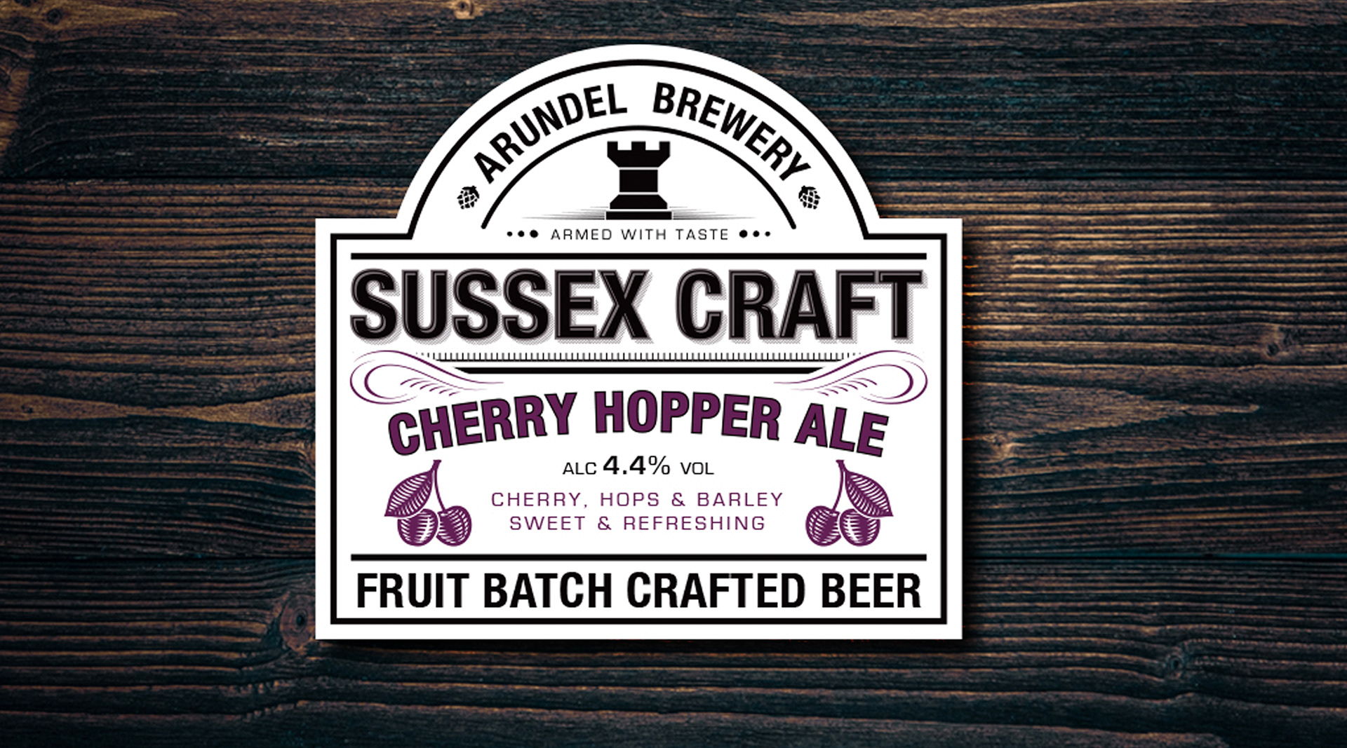
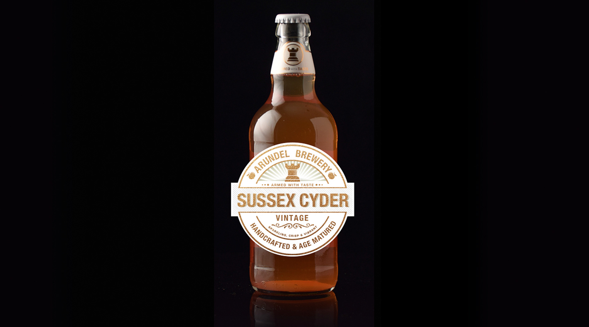
Working with Arundel Brewery, I led a complete brand refresh designed to modernise the business while celebrating its heritage.
The project included:
Brand identity redesign
New brewery logo
Beer pump clips
Bottle labels
Ale, cider and lager packaging
Supporting marketing collateral
New brewery logo
Beer pump clips
Bottle labels
Ale, cider and lager packaging
Supporting marketing collateral
The result was a more contemporary brand that remained true to the brewery's character while standing out more effectively on the bar and retail shelf.
THAT GIN COMPANY
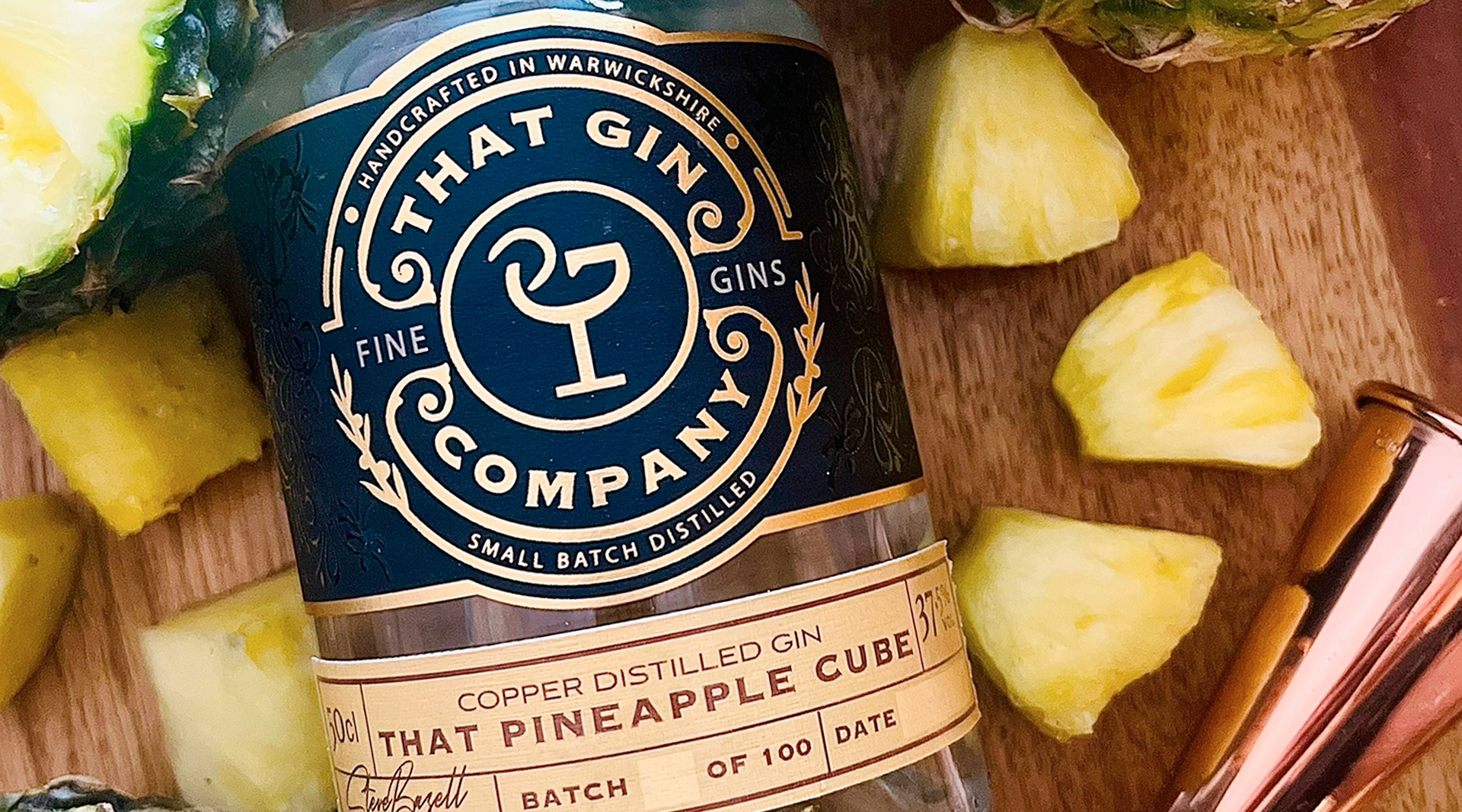
More recently, I worked with Warwickshire-based That Gin Company, refreshing the packaging across their range to create a cleaner, more premium and consistent brand presentation.
The updated designs retained the personality of the business while improving shelf presence and strengthening brand recognition.